
Making accessibility accessible
Issue #2: on demystification and how we can begin to think of accessibility as practice

To make accessible design more accessible for teams and individuals, we need to intentionally lower the barrier to entry, make space for messy conversations, create comfort in struggling together, and think of accessibility as a practice.
Before I go on, I want to be clear that I am a huge advocate for bringing in (and paying) people who’ve put in time and energy into becoming a11y1 experts and advocates. There are so many wonderful folks in the accessibility world, and if you have the means to bring in a lecturer, consultant, or full-time team member, do that!
I want to talk about how we can begin to make conversations around accessibility familiar and comfortable, enabling any designer (or, hell, any person) to participate, lead, and inquire. Accessible design is an ever-evolving practice that has a long way to go, and we must dispel the notion that someone needs to be an expert before they can step into or spark a dialogue. And some good news – you can start creating accessibility practices using what’s already working for you and your teams!
🔨 Tweaking existing cycles and rituals
One progress deterrent I’ve noticed when teams approach accessibility as a practice is the (well-intentioned) push for new rituals that solely center on accessibility. Creating these new rituals takes time. They can feel awkward jumping into and add to the vicious cycle of creating more meetings. Instead, think about what’s working in your design feedback processes and how you can “yes, and” when it comes to accessibility.
Design Crits
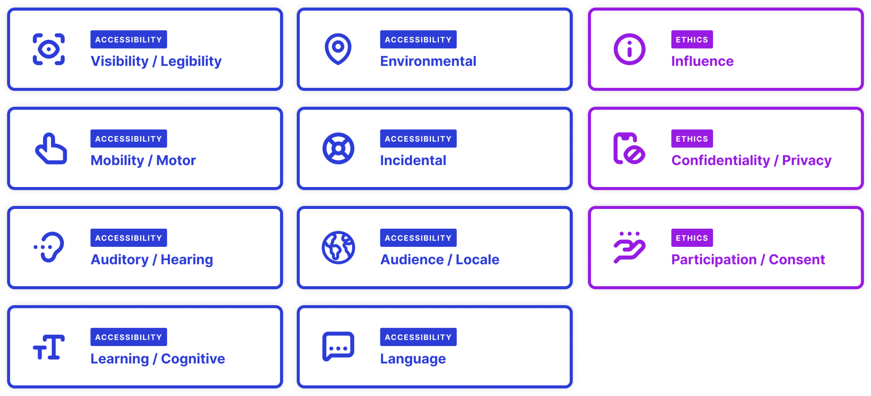
If you’re on a team that uses cards and notes for design crit feedback, consider adding some accessibility marker cards folks can use. By including these cards, a11y is top of mind, and people are reminded of existing considerations regarding access, inclusion, bias, and ethics.
If you’re looking at these and thinking, “I don’t know what some of these mean,” that’s okay! This type of exposure can teach you/others as you go and lowers the barrier to entry.
To (badly) tweak a quote from Field of Dreams, if you add it to the crit tools, the feedback will come.
Release QA
Another way to bring accessibility into your processes is to do QA testing using assistive tech and apps. Of course, it won’t be a perfect test if you’re a non-disabled person using assistive tech you don’t require, but the exposure helps. You can do some simple things, like explore the accessibility features on your devices, turn on voice assist, increase your text size, change your color contrast, or view your builds in different languages. (pro-tip: right-to-left or RTL languages and languages with high ascenders and descenders like Thai are imperative to look at!)
🧪 Run user tests on fable
If you were to ask me about companies I admire, Fable would easily be on my top list. They offer many different types of user tests and setups, all of which get your experiences in front of real users who use various assistive technologies!
Suppose you want to get your feet wet. In that case, they have a free tool that allows anyone to run an AUS (Accessible Usability Scale) survey, which provides a numerical score and some additional detail regarding how usable your product is for different people.
📝 Make a collaborative accessibility sheet and pin it somewhere useful
Yeah, this feels like a no-brainer, but few people do this! Make a FigJam file and start dropping in links and critical questions, then let it evolve as needed.
Something I find helpful is to break apart key questions into pre and post-mortem lists everyone can pull from, which goes back to the first piece of advice I wrote re: tweaking rituals! Here are some examples of a few thought starters I like:
Pre-mortem
Who/what is represented visually?
Who/what is represented contextually?
Who/what is left out?
How does this benefit others?
How might this harm others?
How might this design influence a person?
Does this design relate to current socio-political events?
How might this design pose complications to someone using [insert assistive tech]?
Are there opportunities here to rethink words and curb ableist language? For example – replacing “see” with “discover” or “stand up” with “take charge.”
Are there visual or interactive elements to this design that might be overwhelming to users who are sensitive to motion?
Could this design contribute to ethical harm?
How might we evolve the design in a way that addresses and/or curbs identified ethical harms?
Post-mortem
What about this design wasn’t usable? For who?
What led to this, and why did we build it this way?
Why did it cause ethical trouble?
What combination of factors led to an ethical failing?
What biases did we bring into the project that remained unchecked?
What rituals/dynamics/processes could have prevented this failing?
What needs to change, and what can we amend soon versus what needs additional thought?
Overall, these artifacts and ways of working are ones that I find to be less intimidating and can live on and evolve! Which, to me, is how accessibility as practice will begin to succeed – through demystifying what accessible thinking is and creating mechanisms for open conversations.
🎶 Volume #2
For each issue, I drop three random songs. Here’s the issue #2 round-up:
Oliloqui Valley - Alternate Take/Remastered by Herbie Hancock
Let Down by Radiohead
And So It Goes by Billy Joel (anyone watch the latest episode of This Is Us and sob when this played?)
⏯ Get the playlist on Spotify
A11y is a common abbreviation for “accessibility” — as in, "a" then 11 characters, and then "y"