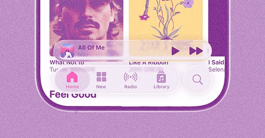
Apple’s “Liquid Glass” announcement got me thinking about a pattern that always seems to show up in these moments: we say we want new things, but it’s hard to meet them with curiosity when they arrive looking unfamiliar.
In one breath: everything looks the same now / design is dead / why doesn’t anyone take risks anymore? In the next: this is unreadable / how could they release this? / what about accessibility?
Both reactions come from a place of care. We want design to move forward, and we want it to serve everyone.
And I do think we genuinely value new ideas when they’re usable, thoughtful, and designed with people in mind. The friction seems to arise when newness arrives first as aesthetic, before we fully understand its utility or accessibility. That’s when the instinct to reject can come on fast.
I’m as cautious as anyone about accessibility, especially now, with DEI efforts shrinking and disabled folks getting pushed farther into the margins by the Trump administration. It’s crucial to ask whether inclusive practices are still prioritized at the highest levels. I’m not here to wave that away.
But, do we really believe Apple would ship an interface that’s fundamentally unusable? Is it not much more possible that what we saw is an early draft—a V1, a visual direction, not the whole story yet?
Us designers often say they want space to show work in progress. In nearly every job I’ve worked as a designer, there are conversations around how we can enable more exploration and early idea sharing, and generally, how we can more frequently invite others into the shaping of something new.
If we actually want new paradigms to emerge, we need to hold more space for the messy middle, for aesthetics that are still becoming, for drafts that are still in conversation with function. Instead of reacting with rejection, we must ask:
How could this visual paradigm grow to include more people?
How might we participate in shaping it, rather than shutting it down?
Design is an iterative process. Not every new pattern will land. Not every experiment will stick. But if we want a world where design doesn’t stagnate, we need to make room for ideas that are still taking shape—and learn to meet them with both care and curiosity.
To be SO for real, a lot of the takes this week have felt boring. It’s easy to be loud about what you don’t like, and it’s harder to acknowledge the craft here, which looks hard! Whether or not you love the aesthetic, the engineering and depth of this system are genuinely impressive. And context matters so much! If you haven’t watched this 20 min deep dive on Liquid Glass, it’s worth it. There’s a lot more happening under the hood than what you catch in a few screenshots, tweets, or click-bait-y LinkedIn posts.
IMO, that kind of space is the part we’re losing right now. In an era of AI summaries, hot takes, compressed feeds, and general lack of comprehension—we’re not exactly creating the conditions for thoughtful, iterative feedback. Because, y’all, good critique isn’t fast! It doesn’t flatten nuance. It asks: What’s working? What’s not? What’s possible here that isn’t yet visible? It makes room for uncertainty and assumes there’s still more to learn.
🎶 Volume #7
For each issue, I include three songs I’m into lately:
Untouched by The Veronicas
Weak In Your Light by Nation of Language
“C.M.” by Max Roach


I feel this - there's simply no way that Apple isn't aware of the accessibility issues, and are planning to address them! Plus, it may look "Dribbble-y", but it's 10x more polished than any of those mockups.